Case Study: Mapping the Blame in Healthcare Cost Coverage
How a Midwest hospital coalition uses custom AI tagging to track who gets blamed for healthcare costs — and why generic monitoring tools couldn't measure that.
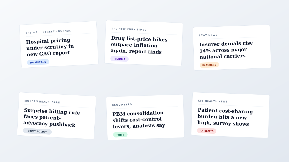
Healthcare cost coverage isn’t a sentiment story. It’s a blame story.
When a major outlet covers rising healthcare costs in America, the article picks a culprit. Sometimes it’s insurers. Sometimes drug manufacturers. Sometimes government policy. Sometimes hospitals themselves.
For a Midwest hospital coalition that uses Briifd — a network of competing-but-allied hospital systems — which culprit each article names isn’t a passing detail. It’s the strategic input the entire PR program is built around.
The strategic problem
The coalition’s PR program isn’t about chasing favorable mentions. It’s about tracking how the national and regional conversation around healthcare cost responsibility is shifting — week by week, outlet by outlet — and who’s getting named.
Every article published about hospital pricing, surprise billing, drug costs, or insurance denials is doing two things at once:
- Naming a culprit — assigning cost responsibility to insurers, drug manufacturers, government policy, hospitals, PBMs, or some other actor
- Naming a player — referencing a specific organization, either one of the coalition’s member systems or an adversary entity in the cost-blame conversation
The PR strategy follows from the answers. If hospital pricing is increasingly framed as the source of cost burden, the coalition needs to counter-message before that frame hardens. If insurer denials are taking the heat in a given quarter, the coalition has narrative cover that frees them up to push other priorities.
What general-purpose monitoring couldn’t do
Before Briifd, the coalition’s PR firm was running a workflow most healthcare comms shops will recognize:
- Meltwater for breadth
- Google Alerts for backup
- A senior comms strategist reading every article that surfaced and manually deciding who the article blamed
- A shared Google Sheet with the “who got blamed” classification typed in by hand
- A monthly export from the sheet into PowerBI for trend visualization
The breadth was fine. The classification was the problem.
The strategist was reading well over a hundred articles a month and tagging two dimensions on each. The PowerBI trend lines were genuinely useful — they fed the coalition’s quarterly strategy reviews — but the time cost of producing them was paid in senior-strategist hours that should have been going to actual strategy work.
What changed: a two-dimension tag schema
The coalition onboarded Briifd to handle the read-and-classify layer. The setup took about three hours, and the core of the configuration is a two-dimension custom tag schema applied to every article that flows in.
Dimension 1: Entity recognition
Every article gets classified by which organizations are named:
- Coalition member — one of the hospital systems in the network
- Adversary entity — a national insurer, PBM, or organization pushing a competing cost-blame frame
- Both — articles where a coalition member and an adversary are named together (the highest-signal articles)
- Neither — general industry coverage with no specific entity named
Dimension 2: Blame attribution
Every article gets classified by which actor the article frames as responsible for cost:
- Insurers
- Drug manufacturers
- PBMs
- Government policy
- Hospitals / providers
- Patients themselves
- Multiple / unclear
These two dimensions, applied across every article that flows in, produce something general-purpose monitoring tools structurally can’t: a continuously updating map of who’s getting blamed in coverage about which players.
The new workflow
The senior strategist no longer reads every article in order to classify it. She reviews the AI’s classifications, spot-checks the close calls, and refines the tag prompts when the AI is consistently wrong about a particular kind of framing — which happens maybe once a month and usually on a single dimension at a time.
Her time now goes to the interpretation layer: looking at the trend lines and asking what they mean for next month’s positioning, which outlets to pitch, which counter-narratives need amplification.
The PowerBI dashboard still exists. The data feeding it now comes from Briifd’s tagged article export instead of the hand-classified Google Sheet. The output looks the same. The labor that produced it is dramatically lower.
The classification stopped being a person’s job. The interpretation became one.
What the schema enables
The two-dimension schema makes a few specific views routine that were rare or impossible before:
- Blame share over time — the percentage of cost-coverage articles assigning blame to each actor, week by week. A rising “hospitals” share is an early warning that a counter-message campaign is needed.
- Coalition-vs-adversary framing — when articles name both a coalition member and an adversary entity, who does the framing favor?
- Outlet-level pattern — does a healthcare-trade publication tend to frame costs differently from the national business press? Knowing which outlet leans where shapes pitch strategy.
The coalition is still early in the engagement, so the outcome story — campaign decisions made, narratives shifted — is a chapter that hasn’t been written yet. What’s already clear is that the inputs to those decisions are now structured, queryable, and reliably updated. The strategy work that follows from those inputs is the next thing to watch.
What it didn’t change
Worth being honest about: the coalition didn’t drop their monitoring tool. Meltwater is still the discovery layer. Briifd does not run its own crawler — that would be the wrong tool for the job. The split is the same one most accounts settle into:
Meltwater finds the haystack. Briifd reads it.
For the broader case on this division of labor, see Briifd vs. Meltwater and Cision.
Why this case generalizes
Most PR monitoring use cases are about reach — how many mentions, what audience, what outlets. The coalition’s use case is about frame — what story is being told, who’s the protagonist, who’s the culprit.
That second category is structurally hard for general-purpose tools because the dimensions that matter aren’t generic. “Who is being blamed in articles about healthcare costs” is a tag that only matters to a small population of buyers. The right tool isn’t one that ships with that tag built in. It’s one that lets buyers define their own — accurately and at scale.
That’s the structural argument for custom AI tagging, and it’s the reason a hospital coalition with an unusual analytical need can get more strategic value out of Briifd than a generic enterprise monitoring contract several times the price.
Working on a PR program where the dimensions that matter don’t exist in your monitoring tool? Custom tag schemas are part of Briifd’s paid plans, starting at $89/month — see plans for details.
Try Briifd on your own coverage
Free tier — no credit card, get started in a few minutes.
Related reading
Your First Week With Briifd: A Checklist
A day-by-day plan for getting your first client onboarded, tagged, and producing reports — without overhauling your existing stack.
Workflow TipsA Week With Briifd: 15 Minutes, Not Eight Hours
Briifd isn't a tool you live in. Here's what 15 minutes of weekly work actually looks like — check, recover, recap, and a few clicks for the report.
ComparisonsBriifd vs. Meltwater and Cision: An Honest Comparison
When to use a traditional monitoring tool, when to use Briifd, and why most agencies end up using both.